33 Week Power Factor Heatmap
The Selector in the top right hand side of the heatmap changes the data
displayed between Consumption, Demand and Power Factor. (Note, add navigation links to relevant articles)
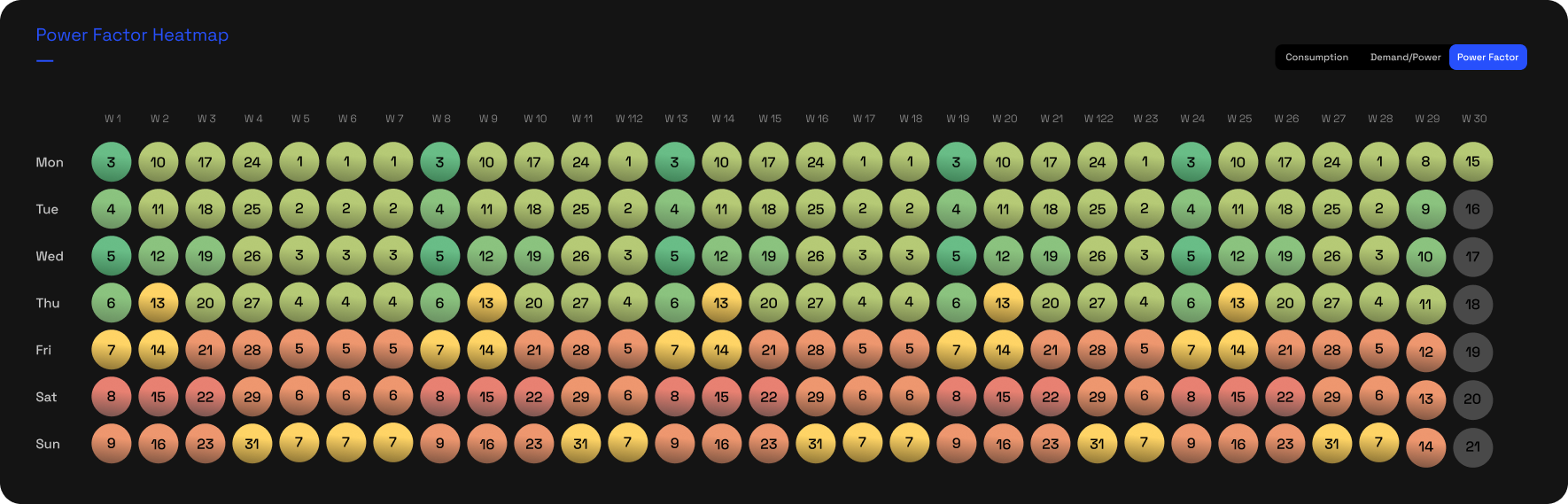
Power Factor Heatmap
The Power Factor heatmap displays a daily view over up to a 33 week period. A set scale is used to indicate a range from good to bad Power Factor.
Darkest green indicates days where the Power Factor was good.
Darkest Red indicates days where the Power Factor was bad.
(Find and include actual scale from page br)
Hovering your cursor over any of the days in the heatmap will display the following data for the hovered day. :
- Date
- Consumption in kWh
- Peak Demand in kVA
- Power Factor at Peak Demand
The Heatmap also functions as a date selector. Clicking any of the
heatmap days will reload the page, displaying thew data for that day.
Related Articles
Power Factor Chart & Heatmap
The Power Factor Bar Chart and Power Factor Heatmap are 2 separate graphic elements, that work together to provide a insightful view on your Power Factor. The Selector in the Bar Chart area changes the data viewed between Consumption, Demand and ...33 Week Demand Heatmap
The Selector in the top right hand side of the heatmap changes the data displayed between Consumption, Demand and Power Factor. (Note, add navigation links to relevant articles) The Demand heatmap displays a daily view over up to a 33 week period. ...33 Week Consumption Heatmap
The Selector in the top right hand side of the heatmap changes the data displayed between Consumption, Demand and Power Factor. Note, add navigation links to relevant articles) The Consumption heatmap displays a daily view over up to a 33 week ...Demand Chart & Heatmap
The Demand/Power Bar Chart and Demand Heatmap are 2 separate graphic elements, that work together to provide a insightful view on your Demand (kVA). The Selector in the Bar Chart area changes the data viewed between Consumption, Demand and Power ...Consumption Chart & Heatmap
The Consumption Bar Chart and Consumption Heatmap are 2 separate graphic elements, that work together to provide a insightful view on your energy Consumption (kWh). The Selector in the Bar Chart area changes the data viewed between Consumption, ...