Page Overview - Power Factor & Demand
Purpose of Page
The Power Factor & Demand page provides a detailed view of the Peak Demand and Power Factor of the site (or Billing Point), along with a sub point breakdown of the critical metrics that allow you to manage your sites demand and power factor infrastructure to support risk mitigation and financial assurance goals.
Point Selector
Any Site or Billing Point that the user has access to can be selected on this page.
The Sub metering points one level down form the selected site or billing point is displayed in the Main Point/s Contribution Charts as well as the Performance Tables.
Date Selector
Any 24 Month period which the site has had Augos measurement installed can be viewed.
- 3 Dot Menu
The 3 Dot menu next to the date selector will allow you to:
Navigate to our data download modal, giving you the option of downloading your preferred data.
View Tariff scheme details provides a detailed view of the tariff loaded to the selected billing point.
Peak Demand & Power Factor Chart
This Chart provides a 24 Month trend, displaying Peak demand, Power at Peak, and Power factor at Peak for the selected Point. Easily detect increases in demand, and potential issues with Power factor equipment.
Hovering your cursor over any of the months in the chart will display the following data for the hovered day. :
- Month
- Peak Demand in kVA
- Power at Peak Demand in kW
- Power Factor at Peak Demand
- Reactive Power at Peak Demand in kVAr

Cost & Performance Tiles
This table provides a list view of the billing point, and each one of its sub meters. Its purpose is to apportioning the total billing point cost to all installed sub measurement points according to actual usage.
Allocate costs to the areas where they are incurred, and pinpoint the significant energy users and contributors to Maximum Demand and Consumption.

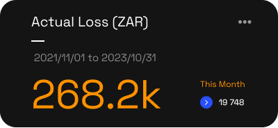
This tile displays the Actual losses incurred over a 24 month period, due to the Power Factor not being at unity.
This is calculated by taking the maximum 30min average demand (kVA) for a billing period, measured at the billing point.
This value assists in determining the financial feasibility or the required work to get Power Factor to unity.
It also shows the Actual Loss for the current month in small text, on the right hand bottom side of the tile.
3 Dot Menu
On the Top right hand side of the Tile is a 3 dot menu:
View Charting
This navigates you to the Charting Page where you can select the relevant metrics and periods to further interrogate the data.
Set Up Triggers
This Navigates you to the Triggers setup page where you can configure custom Power Factor and Demand alerts.
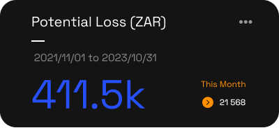
This tile displays the Potential losses incurred over a 24 month period, due to the Power Factor not being at unity.
This is relevant to sites with multiple incomers making up a billing point. This value is calculated by taking the maximum 30min average demand (kVA) for a billing period, measured at each individual incomer, making up the billing point, and summing the values. This shows what the Peak demand, and Power Factor potentially could have been based on actual point usage.
This value assists in determining the additional financial risk above Actual Loss, and should and can be used when determining the ideal reactive power requirements for a site or point.
It also shows the Potential Loss for the current month in small text, on the right hand bottom side of the tile.
3 Dot Menu
On the Top right hand side of the Tile is a 3 dot menu:
View Charting
This navigates you to the Charting Page where you can select the relevant metrics and periods to further interrogate the data.
Set Up Triggers
This Navigates you to the Triggers setup page where you can configure custom Power Factor and Demand alerts.
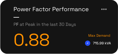
Power Factor Performance
This tile displays the Power Factor at Peak Demand in the last 30 Days
It also shows the Peak demand for the last 30 days in small text, on the right hand bottom side of the tile.
3 Dot Menu
On the Top right hand side of the Tile is a 3 dot menu:
View Charting
This navigates you to the Charting Page where you can select the relevant metrics and periods to further interrogate the data.
Set Up Triggers
This Navigates you to the Triggers setup page where you can configure custom Power Factor and Demand alerts.
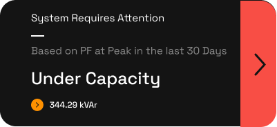
Dynamic Tile
This tile content will change based on the specific parameters on site.
System Requires Attention - Under Capacity
The reactive power indicates that Power Factor Capacity is required to get the site to unity, and maximise demand savings.
This could require:
A new System Installation for sites with no, or too few PFC systems.
Upgrade is required on existing equipment to increase capacity.
Repairs on existing equipment is required.
System OK - PFC Capacity Sufficient
Power Factor is at, or close to Unity and no action is currently required.
System Requires Attention - Service Due in 30 Days
Based on our records, your next Power Factor Correction Survey is due in the next 30 Days.
We recommend having all PFC Equipment surveyed at least once every 12 months. Sites with excessive heat, dust, and other environmental factors should consider more frequent surveys schedules.
If our records are incorrect, please contact our team to update the systems.
To book your survey, click on "Book a PFC Survey"
System Requires Attention - Service Overdue!
Based on our records, your next Power Factor Correction Survey is Overdue.
We recommend having all PFC Equipment surveyed at least once every 12 months. Sites with excessive heat, dust, and other environmental factors should consider more frequent surveys schedules.
If our records are incorrect, please contact our team to update the systems.
To book your survey, click on "Book a PFC Survey"
Tile Menu
When Clicking on the arrow on the right hand side of the tile, the following options are presented.
Book a PFC Survey
Your survey request is sent to our team who will get back to you with a quote to survey all units on site, as soon as possible.
Request a call from a consultant
Any questions about the data you are looking at? Click here and one of our knowledgeable consultants will be in contact to assist you.
Request a Quote
Need maintenance, repairs, or new installation costing? Click here and one of our knowledgeable consultants will be in contact to assist you

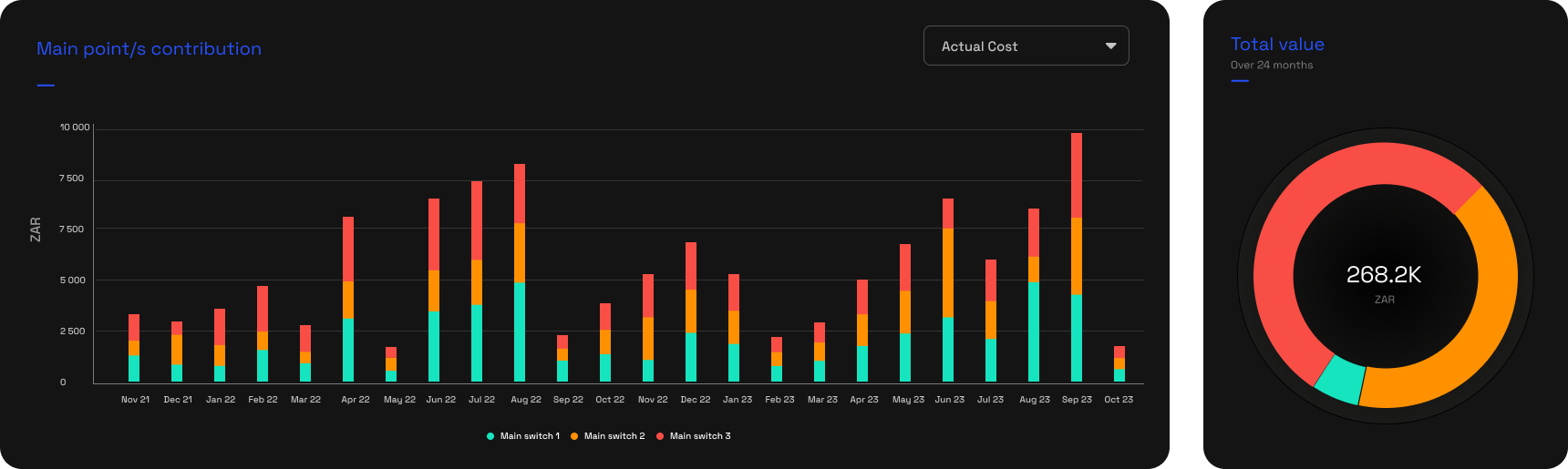
Main Point/s Contribution Bar & Donut Charts
The Main Point/s Contribution charts provides a 24 Month detail view of the critical metrics that allow you to manage your sites demand and power factor infrastructure, breaking down the data to the sub measurement points.
The following metrics can be viewed individually through the dropdown selector in the top right hand side of the bar chart.
Potential kVAr
Performance Table
These data tables allow you to drill down from the billing point to the incomer level of the hierarchy and determine the point by point Power Factor requirements, and financial impacts.
Table Data Downloads
Next to the Tariff Information are 3 icons.
XLSX - Download the table data in XLSX Format
CSV - Download the table data in CSV Format
Copy Table - Copy the table data to your clipboard. You are then able to paste the data in the sheet of your choice.
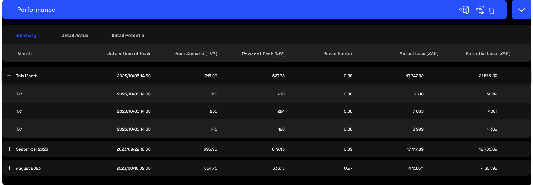
Summary
As the name suggests, this table give a 24 month summary view of the site or billing point. It Also allows you to expand each months view to see the data for the incomer level measurement points.
The following Data is available:
Total Date & Time of Peak
Peak Demand (kVA)
Power at Peak (kW)
Power Factor
Actual Loss (ZAR)
Potential Loss (ZAR)
- Detail Actual
Get a more detailed view.
The site and each incomer level measurement point is listed, with the ability to expand by clicking on the orange arrow on the right hand side. This provides a 24 month view of the following information:
Peak demand (kVA)
Power at peak (kW)
Power factor at peak (PF)
Reactive power at peak (kVAr)
Additional Info from the summary Page:
Reactive Energy (kVARh)
Demand Based Cost (ZAR)
All Demand Based Cost items will be listed as per your specific tariff
Corrected Demand Based Cost (ZAR)
All Demand Based Cost items will be listed as per your specific tariff
Actual Cost Savings Available (ZAR)
Detail Potential
Get a more detailed view of the potential financial risks.
The site and each incomer level measurement point is listed, with the ability to expand by clicking on the orange arrow on the right hand side. This provides a 24 month view of the following information:
Peak demand (kVA)
Power at peak (kW)
Power factor at peak (PF)
Reactive power at peak (kVAr)
Additional Info from the summary Page:
Reactive Energy (kVARh)
Demand Based Cost (ZAR)
All Demand Based Cost items will be listed as per your specific tariff
Corrected Demand Based Cost (ZAR)
All Demand Based Cost items will be listed as per your specific tariff
Potential Cost Savings Available (ZAR)
Related Articles
Page Overview - Dashboard
Purpose of Page The Utilities & Services Dashboard provides an executive daily overview of your energy usage. It also aims to provide energy insights through the use of graphic elements like heatmaps, to allow the visualisation of waste, savings ...
Power Factor Chart & Heatmap
The Power Factor Bar Chart and Power Factor Heatmap are 2 separate graphic elements, that work together to provide a insightful view on your Power Factor. The Selector in the Bar Chart area changes the data viewed between Consumption, Demand and ...
33 Week Power Factor Heatmap
The Selector in the top right hand side of the heatmap changes the data displayed between Consumption, Demand and Power Factor. (Note, add navigation links to relevant articles) Power Factor Heatmap The Power Factor heatmap displays a daily view over ...
Page Overview - Technical Analysis
Purpose of Page The Technical Analysis Table displays all measurement points that are downstream from the point selected in the point selector. It provides a quick view of the Last Activity, Consumption, Demand and Power Factor for each point, for ...
Page Overview - Data Download
Purpose of Page The Data Download function provides access to raw data downloads for any measurement point, over any period, and in your preferred table format. Select Measurement point All measurement points and types can be selected. Choose the ...