Page Overview - Dashboard
Purpose of Page
The Utilities & Services Dashboard provides an executive daily overview of your energy usage.
It also aims to provide energy insights through the use of graphic elements like heatmaps, to allow the visualisation of waste, savings opportunities and potential risks.
Point Selector
Only "Sites" can be selected on this page.
Sub metering points can be viewed in in the Technical Analysis Table further down the page.
Date Selector
This page looks at single days. The date selector allows you to select any day for the period that you have had measurement installed.
The Heatmap also functions as a date selector. Clicking any of the
heatmap days will reload the page, displaying the data for that day.
Product Selector
The product selector allows you to switch between different energy types.
These include:
Electricity
Water
Fuel
Gas
- 3 Dot Menu
The 3 Dot menu next to the date selector will give you access to the Tariff scheme details modal.
This modal will give you a detailed breakdown of the tariff that has been linked to the point you are viewing.
Load Shedding Indicator
This displays the current load shedding stage when looking at the current day.
Executive Summary Tiles
The
Executive summary tiles allow a fast assessment of the day to day
utilities metrics, highlighting consumption, demand, power factor and
cost.
Energy Consumption
The main value on thew energy consumption tile displays Daily Total Consumption in kWh for the selected day.
The secondary value below is a Daily
Energy Movement Indicator, comparing the main value to the previous
days consumption, and showing a percentage (%) movement up or down.
Maximum Demand
The main value on the Maximum Demand Tile Displays the Daily Peak Demand in kVA for the selected day.
The secondary value below is a Daily
Energy Movement Indicator, comparing the main value to the previous
days Maximum Demand, and showing a percentage (%) movement up or down.

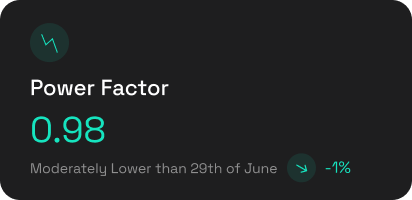
The main value on the Power Factor Tile Displays the Daily Power Factor at Maximum Demand Value for the selected day.
The secondary value below is a Daily
Energy Movement Indicator, comparing the main value to the previous
days Power Factor at Maximum Demand, and showing a percentage (%) movement up or down.
Estimated Cost
The main value on the Estimated Cost Tile Displays the Daily Estimated Cost for the selected day.
The
secondary value below is a daily cost movement Indicator, comparing the
main value to the previous days Estimated Cost, and showing a
percentage (%) movement up or down.
How is the Estimated Cost Calculated?
Estimated costs are calculated on a fixed billing period using full calendar months.
On
the first day of the month, all fixed costs are applied to the billing
period, and added to that days cost, along with that days actual maximum
demand and consumption costs.
Following
days display the movement in costs. This will include all consumption
costs for the day, and any increase in the peak demand, over previous
days in the billing period.

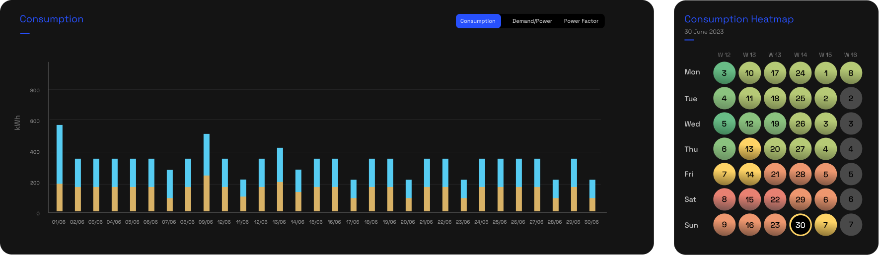
Consumption, Demand & Power Factor Chart & Heatmap
The Bar Chart and Heatmap are 2 separate
graphic elements, that work together to provide a insightful view on
your energy Consumption (kWh), Demand (kVA) & Power Factor.
The Selector in the Bar Chart area
changes the data viewed between Consumption, Demand and Power Factor.
The data displayed in both the bar chart, and heatmap will change to
display the selected data.
The Heatmap also functions as a date selector. Clicking any of the
heatmap days will reload the page, displaying thew data for that day.
Bar Chart
The bar chart displays consumption in kWh, in 30 minute intervals.
If
you have multiple sub points, the chart will show the total consumption
of the selected point, split into the sub meters that are 1 level down
from the selected point. This is done through stacking of the bars in
the chart.
Hovering your cursor over any of the bars will display:
Date and Time
Total Consumption in kWh
Sub points Consumption in kWh
Consumption Heatmap
The
Consumption heatmap displays a daily view over up to a 6 week period.
The lowest and highest total daily consumption over the period is used
to create a colour scale. This allows us to visually represent daily
consumption fluctuations.
Darkest green indicates the lowest consumption days.
Darkest Red indicates the highest consumption days.
Hovering your cursor over any of the days in the heatmap will display the following data for the hovered day. :
Date
Consumption in kWh
Peak Demand in kVA
Power Factor at Peak Demand
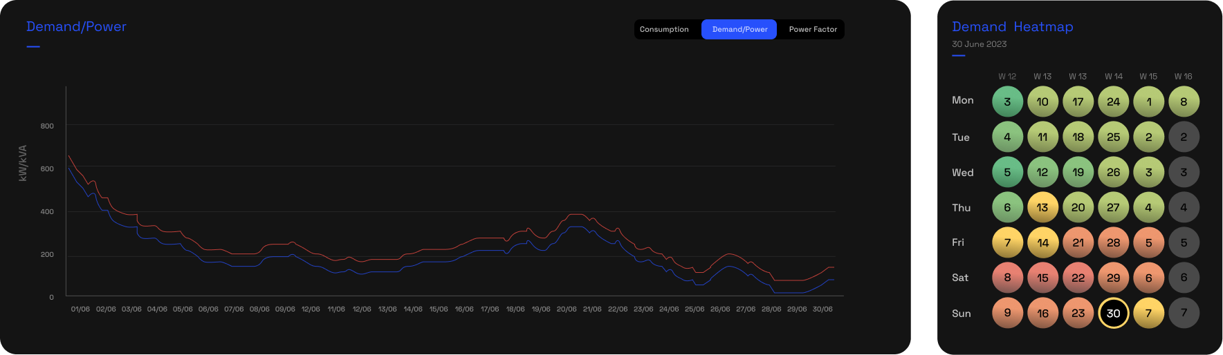
Line ChartThe bar chart displays Demand in kVA, in 30 minute intervals.
Hovering your cursor over the line chart will display:
Date and Time
Demand in kVA
Power in kW
Demand Heatmap
The
Demand heatmap displays a daily view over up to a 6 week period. The
lowest and highest daily Demand over the period is used to create a
colour scale. This allows us to visually represent daily Demand
fluctuations.
Darkest green indicates the lowest Demand days.
Darkest Red indicates the highest Demand ays.
Hovering your cursor over any of the days in the heatmap will display the following data for the hovered day. :
Date
Consumption in kWh
Peak Demand in kVA
Power Factor at Peak Demand
Bar ChartThe bar chart displays Power Factor, in 30 minute intervals.
Hovering your cursor over any of the bars will display:
Date and Time
Power Factor
Power Factor Heatmap
The
Power Factor heatmap displays a daily view over up to a 6 week period. A
set scale is used to indicate a range from good to bad Power Factor.
Darkest green indicates days where the Power Factor was good.
Darkest Red indicates days where the Power Factor was bad.
(Find and include actual scale from page br)
Hovering your cursor over any of the days in the heatmap will display the following data for the hovered day. :
Date
Consumption in kWh
Peak Demand in kVA
Power Factor at Peak Demand

Technical Analysis Table
The Technical Analysis Table displays all measurement points that are downstream from the point selected in the point selector.
It provides a quick view of the Last Activity, Consumption, Demand and Power Factor for each point, for the selected day.
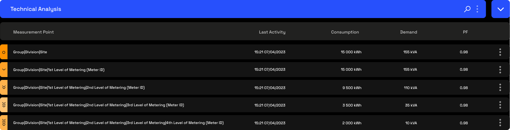
The left hand side of each rows displays the level of each point within the hierarchy.
o - This indicates that the point is at "Site" level and should display the total consumption for the site. This should in most cases be a virtual meter.
> - This indicates that the point is at the first level down from the site. This can either be an actual, or virtual meter.
>> - This indicates that the point is at the Second level down from the site. This can either be an actual, or virtual meter.
>>> - This indicates that the point is at the Third level down from the site. This can either be an actual, or virtual meter.
>>>> - This indicates that the point is at the Fourth level down from the site. This can either be an actual, or virtual meter.
Each meter at a specific level is a child of the level above it. This structure is what creates our metering hierarchy. The hierarchy should be seen as an energy flow and set up to ensure the site total is accurate, all billing points are accurate, and that the sub meters are fed from the correct parent meters.
Expanding Charts
When
clicking on the hierarchy level indicator on the left hand side (orange
block), the row will expand to display 3 charting options.
The default view will be Demand/Power, but the toggle on the right hand side allows you to switch between 3 charting options:
Demand/Power Line chart - Displays 1 minute interval Demand (kVA) and Power (kW).
Consumption Bar Chart - Displays 1 minute interval Consumption (kWh).
Power Factor Bar Chart- Displays 1 minute interval Power Factor.
Each of these charts give the ability to zoom in on a specific time period by clicking and dragging between two points.
The
slider below the chart also allos you to click and drag to change the
date range you are viewing, without using the date selector.

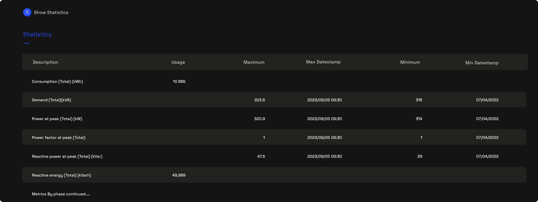
Expanding Statistics
Below
the chart is a blue expansion button named "Show Statistics". Clicking
this expands the statistics table that gives a table view of all energy
metrics available for that point.
33 Week Consumption, Demand & Power Factor Heatmap
The
heatmap displays a daily view of Consumption, Demand & Power Factor over up to a 33 week period.
The Heatmap also functions as a date selector. Clicking any of the heatmap days will reload the page, displaying thew data for that day.
Consumption
The lowest and highest total daily consumption over the period is used
to create a colour scale. This allows us to visually represent daily
consumption fluctuations.
Darkest green indicates the lowest consumption days.
Darkest Red indicates the highest consumption days.
Demand/Power
The lowest and highest daily Demand over the period is used to
create a colour scale. This allows us to visually represent daily Demand
fluctuations.
Darkest green indicates the lowest Demand days.
Darkest Red indicates the highest Demand days.
Power Factor
A set scale is used to indicate a
range from good to bad Power Factor.
Darkest green indicates days where the Power Factor was good.
Darkest Red indicates days where the Power Factor was bad.
Hovering your cursor over any of the days in the heatmap will display the following data for the hovered day. :
Date
Consumption in kWh
Peak Demand in kVA
Power Factor at Peak Demand
Related Articles
Page Overview - Dashboard
Purpose of Page The Utilities & Services Dashboard provides an executive daily overview of your energy usage. It also aims to provide energy insights through the use of graphic elements like heatmaps, to allow the visualisation of waste, savings ...
Page Overview - Dashboard
Purpose of Page This dashboard aims to bring all sensing & monitoring devices into a single, easy to visualise and understand page. Due to the general high number of sensors installed per site, the dashboard aims to highlight exceptions and points ...
Page Overview - Bill Verification
Purpose of Page The Bill verification page is a tool that allows users to verify the accuracy of electricity billing by comparing council/Landlord measurements with what we measured for a specific billing period. We are then able to provide a ...
Page Overview - Cost Allocation
Purpose of Page Where the cost breakdown page allocates all billing point costs according to usage through the entire hierarchy, the cost allocation page allows for custom internal energy cost allocation according to your organisation's specific ...
Page Overview - Triggers
Purpose of Page The Triggers function allows users to create custom alerts for any device, in order for the system to send the user a notification once the specified parameter measures outside the specified conditions. Notifications are sent via: ...