Page Overview - Cost Breakdown
Purpose of Page
The Cost Breakdown page provides a detailed energy cost view of the entire site, providing both a full cost breakdown of the billing point into the individual tariff line items, as well as apportioning the total cost to all installed sub measurement points.
Note, this page should not be used for Tenant Billing. For tenant billing, the full tariff charges should be applied to each tenants main points, instead of apportioning the total cost to the tenant points.
PDF Report Download
There is a downloadable PDF report for the period currently being viewed. This can easily be used to print or to share. To download, click on the 3 dot menu next to the date selector at the top right hand side of the page. There you will find the option to "Download PDF". Click this and your report will be generated and downloaded shortly.
Point Selector
Any Billing Point that the user has access to can be selected on this page.
All Sub metering points of the selected billing point is displayed in the Sub Measurement Cost Breakdown Table.
Date Selector
Due to the nature of utility type billing, this page allows for 2 date ranges:
Calendar Month
This allows you to easily look at any full calendar month.
Billing Period
In order to view a billing period that mirrors your utility account, a Billing Periods need to be created on the bill verification page.
Once the period has been created, ot will appear as an option on the cost breakdown page.
Product Selector
The product selector allows you to switch between different measurement types.
These include:
Electricity
Water
Fuel
Gas
- 3 Dot Menu
The 3 Dot menu next to the date selector will allow you to:
Navigate to our data download modal, giving you the option of downloading your preferred data.
Download a Cost Breakdown PDF file, for the point and period selected.
Billing Point Cost Breakdown Chart & Table
Easily view Month To Date Costs Breakdown and Historical Costs Breakdowns, while having a quick view of 12 Month Cost Trends By Tariff Line Item.
Tariff Item Contribution to Cost Bar Chart
This chart provides a quick visual reference to the significant contributors to your billing period cost.

Tariff Information
On the right hand side, the tariff loaded to the selected billing point will be displayed.
Table Data Downloads
Next to the Tariff Information are 3 icons.
XLSX - Download the table data in XLSX Format
CSV - Download the table data in CSV Format
Copy Table - Caopy the table data to your clipboard. You are then able to paste the data in the sheet of your choice.
View Details
This opens the Tariff scheme details modal. This provides a detailed view of the tariff loaded to the selected billing point.

Fixed Charges Included vs Fixed Charges Excluded
Easily toggle between a view that includes or excludes fixed charges, depending on your reporting requirements.

Table Data
This table provides a list view of every line item on your tariff, and applies the measured data from your billing point to create a Total cost for a calendar month or billing period.
The following information is displayed:
Units - The measured units on the billing point.
Unit - The unit of measure for each measurement.
Rate (Your Relevant Currency) - The rate charged per measured unit as per the NERSA approved tariff.
Total (Your Relevant Currency) - The Units multiplied by the Rate to give your total cost.
% of Total - The contribution to the total cost.
12 Month Trend - A quick visual representation of the last 12 months costs
This spark line has a hover function to show additional information:
Total Cost for the month hovered

Sub Measurement Cost Breakdown
This table provides a list view of the billing point, and each one of its sub meters. Its purpose is to apportioning the total billing point cost to all installed sub measurement points according to actual usage.
Allocate costs to the areas where they are incurred, and pinpoint the significant energy users and contributors to Maximum Demand and Consumption.
Table Data - Collapsed view (Default)
The default view is a collapsed version of the available data, displaying a list view of the billing point, and each one of its sub meters:
The following headline data is displayed for each point.
12 Month Trend - A quick visual representation of the last 12 months costs
This spark line has a hover function to show additional information:
Total Cost for the month hovered

Table Data - Expanded view (Default)
Each measurement point is able to expand to provide detailed billing data. This is done by clicking on the left hand side orange hierarchy indicator.
The expansion displays all measured
data and applies the tariff rates loaded to the billing point.
Fixed charges are allocated according to each points usage.
Consumption is cumulative and allocated according to each points actual use.
Demand charges are allocated based on the contribution to the sites maximum demand.
The following information is displayed:
Units - The measured units on the billing point.
Unit - The unit of measure for each measurement.
Rate (Your Relevant Currency) - The rate charged per measured unit as per the NERSA approved tariff.
Total (Your Relevant Currency) - The Units multiplied by the Rate to give your total cost.
% of Total - The contribution to the total cost.

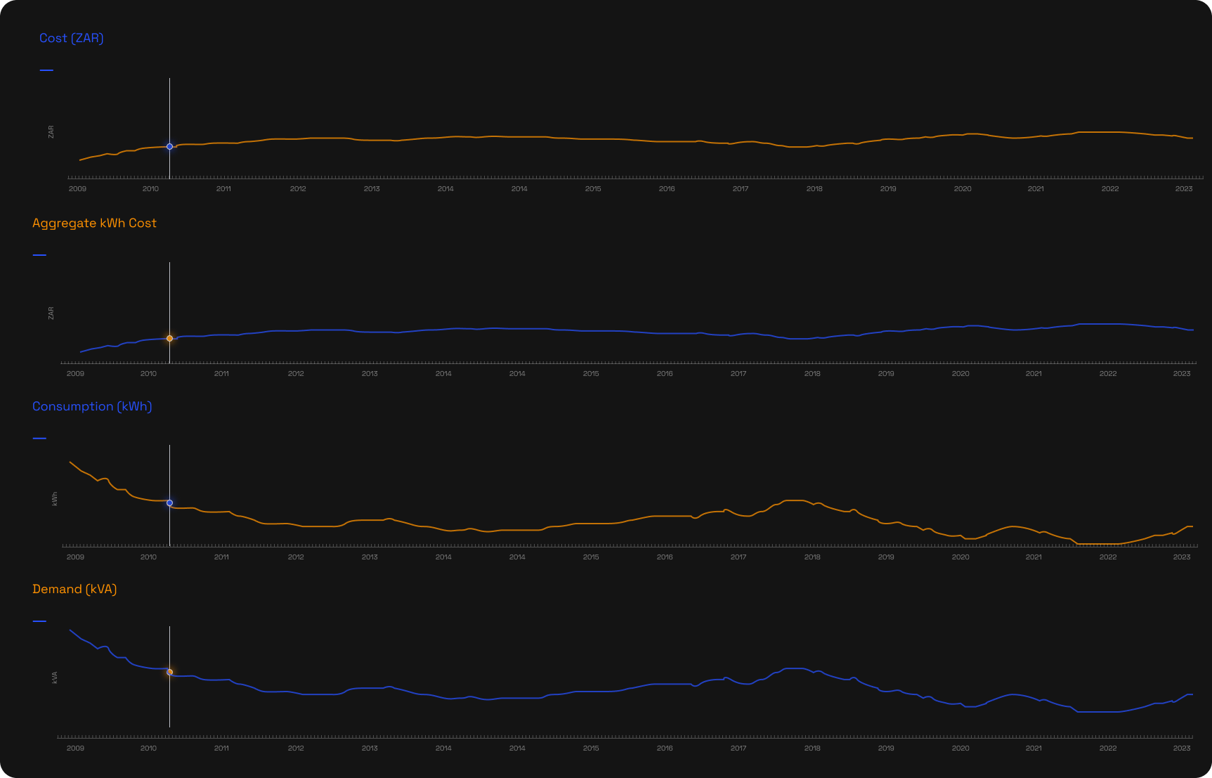
Historic Data
Visualise the trends of 4 critical metrics, month to month, from the date of installation. If you have had your meters installed for 10 years, these charts will show you a 120 month trend.
Demand (kVA)
Related Articles
Page Overview - Cost Allocation
Purpose of Page Where the cost breakdown page allocates all billing point costs according to usage through the entire hierarchy, the cost allocation page allows for custom internal energy cost allocation according to your organisation's specific ...
Page Overview - Dashboard
Purpose of Page The Utilities & Services Dashboard provides an executive daily overview of your energy usage. It also aims to provide energy insights through the use of graphic elements like heatmaps, to allow the visualisation of waste, savings ...
Page Overview - Dashboard
Purpose of Page The Utilities & Services Dashboard provides an executive daily overview of your energy usage. It also aims to provide energy insights through the use of graphic elements like heatmaps, to allow the visualisation of waste, savings ...
Page Overview - Charting
Purpose of Page The Charting page provides the user high levels of custom data viewing capabilities for any device, over any period, and for any available metric. It also allows for periods to be compared. This can provide insights on trends and ...
Page Overview - Charting
Purpose of Page The Charting page provides the user high levels of custom data viewing capabilities for any device, over any period, and for any available metric. It also allows for periods to be compared. This can provide insights on trends and ...